iOS SDK: Styling
ℹ️ This document presents an overview of the configurable style elements of various Vizbee cards for mobile developers and designers using the Vizbee SDKs.
Overview
Vizbee SDK has in-built support for customizable UIs to drive the best conversion from mobile experience to TV experiences. Vizbee UIs have three simple concepts - flows, cards and styles. Vizbee flows (opens in a new tab) are triggered by the mobile app to help the user to interact with Vizbee functionality. Each flow presents a sequence of Vizbee cards. Each card can be styled to customize its layout, appearance and content.
Cards
The following is a list of UI cards presented across various Vizbee flows.
| Card Name | Card Type | Description |
|---|---|---|
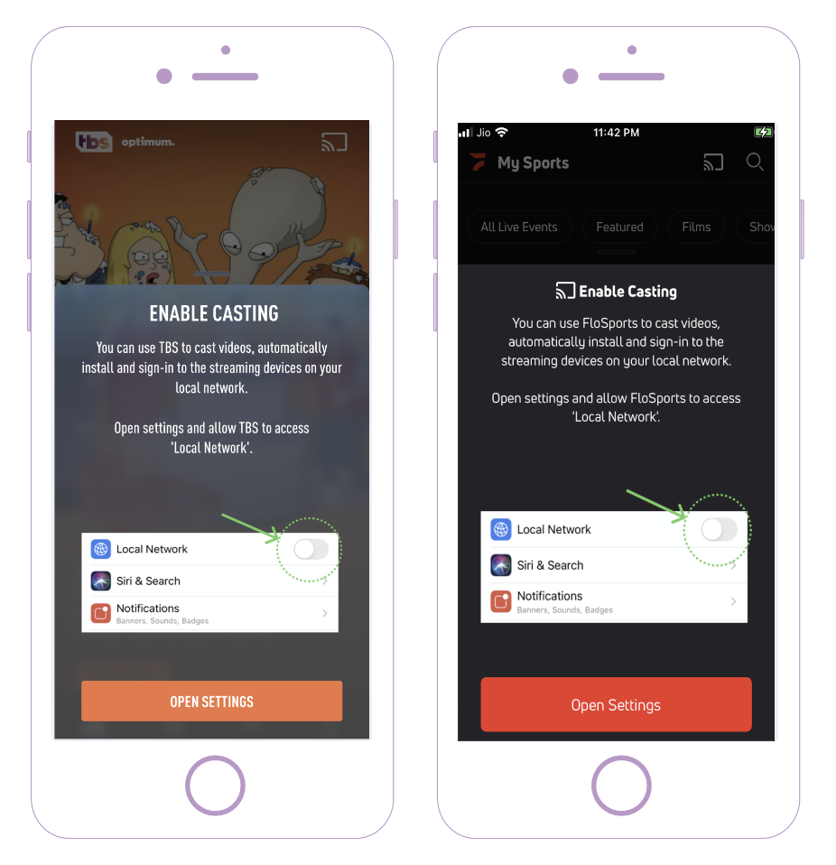
| Cast Authorization Card | Overlay Card | This is the card shown shown to the user only on iOS when they tap on the cast icon and have not given the Local Network Access permission yet. |
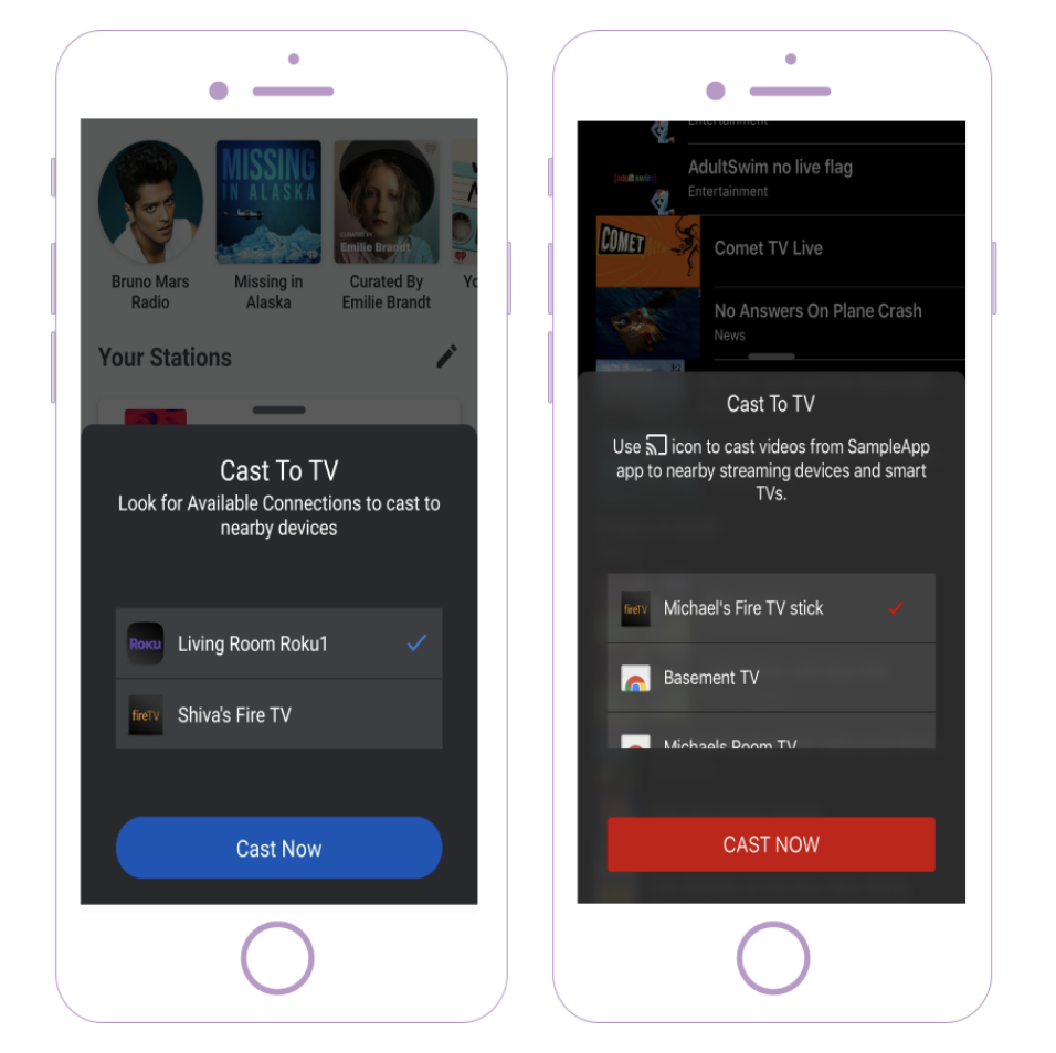
| Cast Introduction Card | Overlay Card | This is the first card shown in the Cast Introduction flow to introduce cast functionality to the user. |
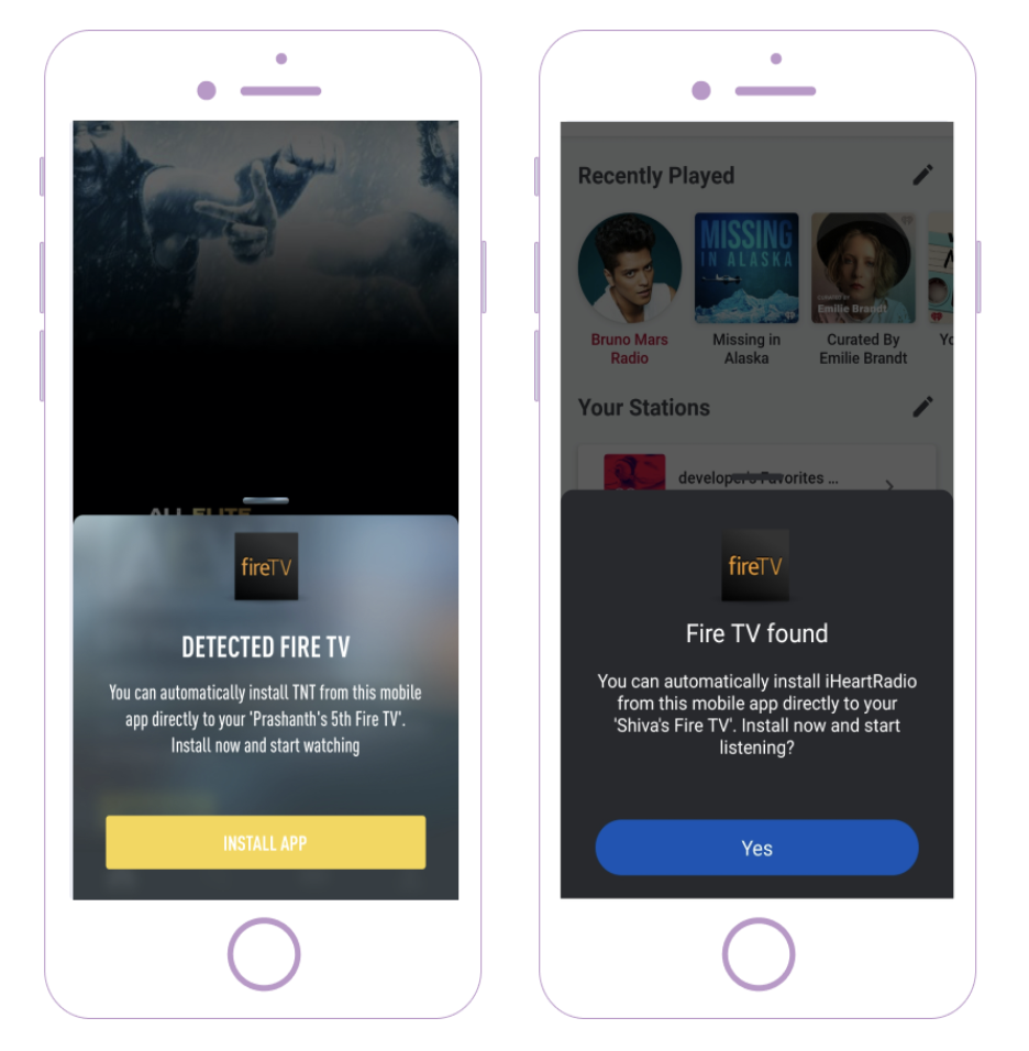
| Smart Install Card | Overlay Card | This is the first card shown in the Smart Install flow to prompt the user to automatically install the streaming app on a neary CTV device. |
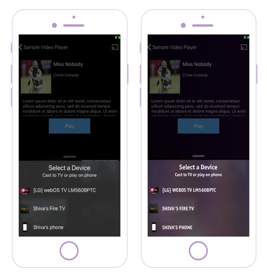
| Smart Play Card | Overlay Card | This is the first card shown in the Smart Play flow. This card prompts the user to select a streaming device or the mobile device for playback after tapping play on a video. |
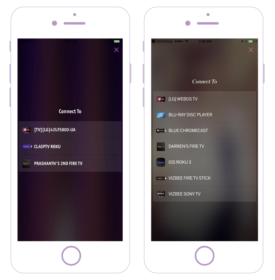
| Device Selection Card | Interstitial Card | This is the card that shows the list of available devices when the user taps on a cast icon. |
| Overlay Card | This is the overlay card that shows the list of available devices when the user taps on a cast icon. | |
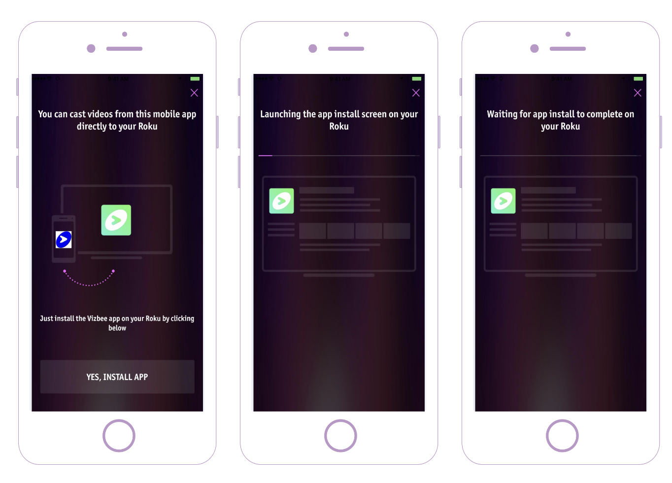
| App Install Card | Interstitial Card | This is the card shown when the user selects a device but the app has not been installed yet. This card guides the user through the automatic installation process. The app install card has a very carefully synchronized UI flow that changes in response to the screen changes on the TV device on which a TV app is being automatically installed. |
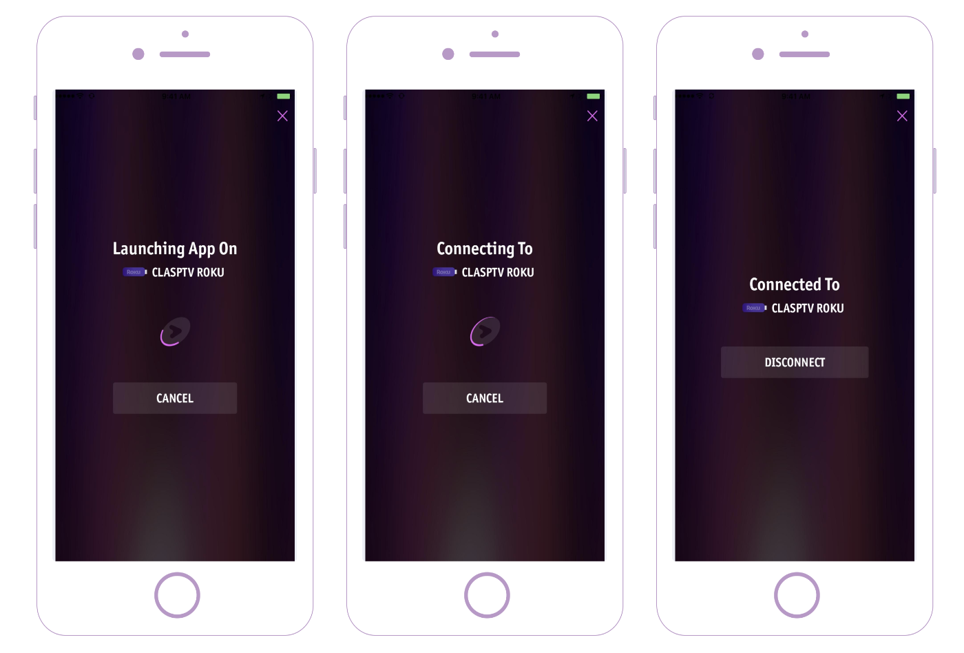
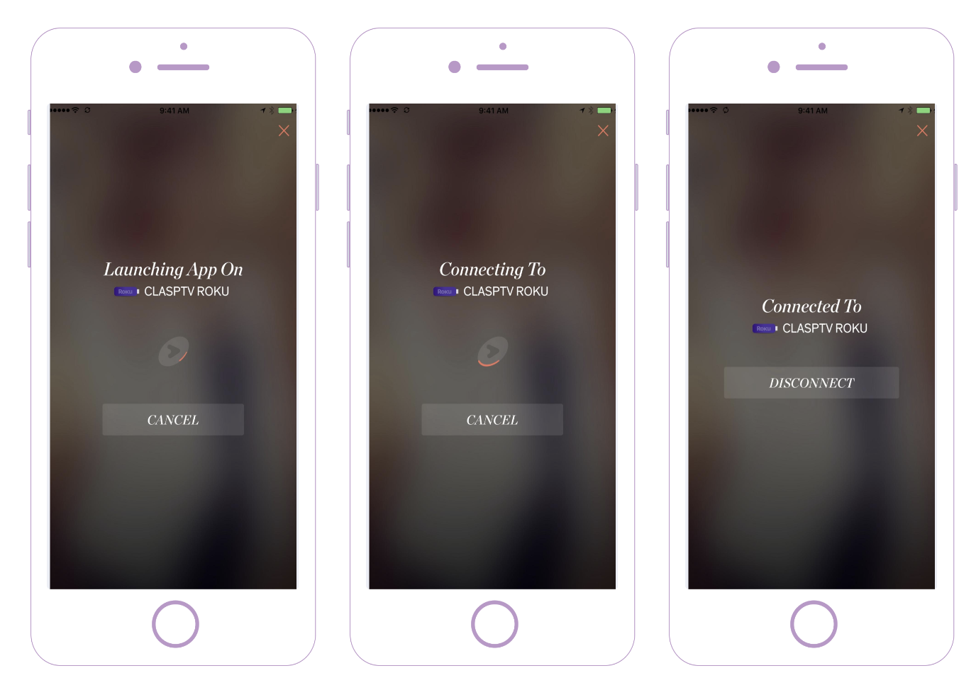
| Device Status Card | Interstitial Card | This is the card that is shown once the user selects a device. The card shows - • Status of the device (launching app, connecting, connected etc.) • Call to action to cancel connection or disconnect from a connected device. |
| Player Card | Interstitial Card | This is the card shown when the user is playing a video. The card enables - • Play/pause/seek/stop and other playback controls • Audio control for chromecast and other devices that support audio controls |
| Full Portrait Image Interstitial Card | This exclusively supports vertical image posters and present them as full screen layout and shown when the user is playing a video. The card enables - • Play/pause/seek/stop and other playback controls • Audio control for chromecast and other devices that support audio controls |
Cards Gallery
The following are some screenshots of Vizbee UI cards with different styles in various mobile apps.
- Cast Authorization Card
- Cast Introduction Card
- Smart Install Card
- Smart Play Card
- Device Selection Card
- App Install Card
- Device Status Card
- Player Card
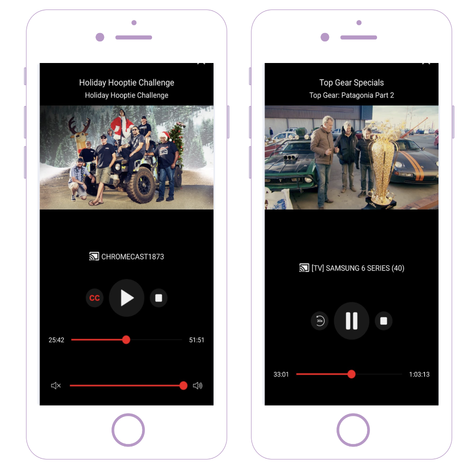
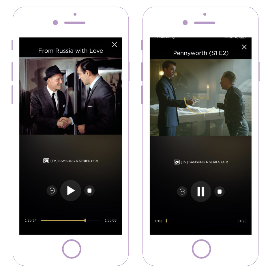
Cards Style Configuration
All the Vizbee cards have completely customizable and styleable UI elements. The broad style properties of the UI cards include aspects such as overall card layouts, card theme colors, card fonts etc. In addition, Vizbee exposes all the native and detailed styling attributes. For example, all buttons can have a corner radius or shadows. For another example, all text properties including fonts, text wrap, case etc. can be configured for each of the UI labels.
The card styles are configured using custom JSON style sheets. These styles must be configured at the SDK integration time.
The following snippets provide examples of customization of the base themes for all cards and also specific style properties of the overlay and interstitial cards.
| Card Type | Styling Snippets |
|---|---|
| All Cards | To style common properties of all cards with a customized base Vizbee Theme, refer to the following snippets. |
| Overlay Cards | To style common properties of all Overlay cards (i.e., Cast Introduction, Smart Install, Smart Play), refer to the following snippets. |
| Interstitial Cards | To style common properties of all Interstitial cards (i.e., Device Selection, App Install, Device Status, Player), refer to the following snippets. |
To style card specific properties for Device Status Card and Player Card, refer to the following snippets.
Cards Text Configuration
Some of the cards have configurable text properties. These include all titles, subtitles, descriptions, button labels etc. These text properties can be viewed and configured directly from the Vizbee Console anytime. All text properties are dynamically loaded into the SDK and can be changed even after the SDK integration.
| Card Name | Text Properties Configuration |
|---|---|
| Cast Authorization Card | See dynamically configurable card text properties here. (opens in a new tab) |
| Cast Introduction Card | See dynamically configurable card text properties here. (opens in a new tab) |
| Smart Install Card | See dynamically configurable card text properties here. (opens in a new tab) |
| Smart Play Card | See dynamically configurable card text properties here. (opens in a new tab) |
| Device Selection Card | See dynamically configurable card text properties here. (opens in a new tab) |
| App Install Card | See dynamically configurable card text properties here. (opens in a new tab) |
| Device Status Card | There are no configurable text properties for this card. |
| Player Card | All text properties are automatically set based on the playing content. |
Snippets for Styling Configuration
Vizbee SDKs have pre-built UI flows and cards that can be easily and flexibly styled with simple configuration. For iOS, Vizbee provides a custom JSON format for styling the various UI cards.
Getting Started
Vizbee provides template style files(JSON for iOS) to get started with customizing the UI. Copy the template style files into your app code to get started with styling the Vizbee SDK UIs.
| Scenario | Snippet | |
|---|---|---|
| 1 | iOS - Copy the template style file into the Vizbee integration folder within your iOS app code for customizing the Vizbee SDK UIs to your app's brand requirements. | Code Setup |
Customize Theme
The first step is to select a theme to style the Vizbee UI cards in your app. Vizbee provides a default Light or Dark theme for your mobile app. All you have to do is to select one of these themes as a base and customize the color pallette and fonts. This will automatically result in a consistent customization of the styles of all Vizbee cards to match your app brand!
| Scenario | Snippet | |
|---|---|---|
| 1 | Light Theme - apply a default Light Theme for all Vizbee cards in an app with light background. | Snippet |
| 2 | Dark Theme - apply a default Dark Theme for all Vizbee cards in an app with dark background. | Snippet |
| 3 | Light & Dark Themes - Define both light and dark themes for Vizbee cards. | Snippet |
Once you have customized the base theme for Vizbee card styles, you may optionally customize specific UI elements such as buttons etc as described below.
Customize Cast Button
Cast button can be included in a tool bar or the layout of a fragment or an activity.
| Scenario | Snippet | |
|---|---|---|
| 1 | Cast Icon Color - Show cast icon added to different screens in same color | Snippet |
| 2 | Cast Icon Color - Show cast icon added to different screens in different color | Snippet |
| 3 | Cast Icon Color - Show cast icon in light/dark theme as per the corresponding appearance setting on the user's device | Snippet |
| Scenario | Snippet | |
|---|---|---|
| 1 | Cast Icon Color - Show cast icon added to different screens in same color | Snippet |
| 2 | Cast Icon Color - Show cast icon added to different screens in different color | Snippet |
Customize Overlay Cards
Overlay cards include Cast Introduction, Smart Install and Smart Play cards that appear partially over your app's screen.
| Scenario | Snippet | |
|---|---|---|
| 1 | Bottom Overlay - show overlay UIs like Smart Install card or Cast Introduction card as bottom overlays | Snippet |
| 2 | Middle Overlay - show overlay UIs like Smart Install card or Cast Introduction card as middle overlays | Snippet |
| Scenario | Snippet | |
|---|---|---|
| 1 | Rectangular Overlay - show overlay UIs like Smart Install card or Cast Introduction card as rectangular overlays with sharp corners | Snippet |
| Scenario | Snippet | |
|---|---|---|
| 1 | Title and Subtitle - show overlay UIs like Smart Install card or Cast Introduction card with customized Title and Subtitle | Snippet |
| Scenario | Snippet | |
|---|---|---|
| 1 | Rectangular Buttons - show overlay UIs like Smart Install card or Cast Introduction card with rectangular buttons | Snippet |
| 2 | Rounded Buttons - show overlay UIs like Smart Install card or Cast Introduction card with rounded buttons | Snippet |
| Scenario | Snippet | |
|---|---|---|
| 1 | Filled Buttons - show overlay UIs like Smart Install card or Cast Introduction card with filled buttons | Snippet |
| 2 | Outlined Buttons - show overlay UIs like Smart Install card or Cast Introduction card with outlined buttons | Snippet |
Customize Interstitial Cards
Interstitial cards include Device Selection, Device Status, App Install and Player cards that are displayed full screen in your mobile app.
| Scenario | Snippet | |
|---|---|---|
| 1 | Rectangular Buttons - show interstitial UIs like Device Status card or App Install card with rectangular buttons | Snippet |
| 2 | Rounded Buttons - show interstitial UIs like Device Status card or App Install card with rounded buttons | Snippet |
| Scenario | Snippet | |
|---|---|---|
| 1 | Filled Buttons - show interstitial UIs like Device Status card or App Install card with filled buttons | Snippet |
| 2 | Outlined Buttons - show interstitial UIs like Device Status card or App Install card with outlined buttons | Snippet |
Customize Specific Cards
Show Pairing Card with customised fonts and colors for text (Header, Footer and Buttons Text).
| Scenario | Snippet | |
|---|---|---|
| 1 | Customise - Show Pairing Card with customised fonts and colors for text (Header, Footer and Buttons Text). | Snippet |
Show AppInstall Card with customized font for text (Header, Footer and Buttons Text) and custom app icon.
| Scenario | Snippet | |
|---|---|---|
| 1 | Adjust font sizes - Show AppInstall Card with customized font for text (Header, Footer and Buttons Text). | Snippet |
| 2 | Change App Icon - Show AppInstall Card with customized app icon. | Snippet |
Player card has multiple UI controls. Broadly, it includes video Title, Subtitle and Image in the top portion of the player card. It also includes Device Status, Playback Buttons, Video Seek Bar and Audio Seek Bar in the bottom portion of the player card.
| Scenario | Snippet | |
|---|---|---|
| 1 | Hide Player Card Completely - Hide Vizbee player card completely to show your own customized version of the player card. | Snippet |
| 2 | Hide Player Card For Join or New Casting Video Scenario - Hide Vizbee player card from being shown automatically either when (a) mobile auto detects a video playing on the TV when it first connects to the TV or (b) user selects a new video after connecting to the TV. I.e., player card is shown only when the user taps the cast icon or the mini player. | Snippet |
Order and Visibility of Player Card Controls
| Scenario | Snippet | |
|---|---|---|
| 1 | Player Controls Order - Change the order of player card controls (Device Status, Playback Buttons, Video Seek Bar and Audio Seek Bar). | Snippet |
| 2 | Hide Audio Seek Bar - Hide Audio Seek Bar in the player card | Snippet |
| Scenario | Snippet | |
|---|---|---|
| 1 | Circular Thumb - Show a circular thumb for Video & Audio Seek Bar controls with customizable thumb dimension and progress color | Snippet |
| 2 | Rectangular Thumb - Show a rectangular thumb for Video & Audio Seek Bar controls with customizable thumb dimension, progress color | Snippet |
Customize the number, order and type of the playback buttons (including Fast Forward, Closed Captions, Play & Pause, Rewind, Stop) shown on the player card.
| Scenario | Snippet | |
|---|---|---|
| 1 | Show 5 Playback Buttons - Show 5 playback buttons including Closed Captions, Rewind, Play & Pause, Fast Forward and Stop. | Snippet |
| 2 | Show 3 Playback Buttons - Show 3 playback buttons including Closed Captions, Play & Pause and Stop. | Snippet |
| 3 | Disable Play & Pause Button For Live Content - Disable Play & Pause button for Live content | Snippet |
| 4 | Change Order of Playback Buttons - Change the order of playback buttons shown in the player card | Snippet |